Before going through documentation chapters, thanks for purchasing Media Grid and trusting LCweb!
Need further help?
Need a customization?
On first plugin's activation, it must be activated in order to work.
Head to the LCweb Dashboard page: it contains the summary of all LCweb products with useful links and their validation forms.

LCweb Shop License:
Your license is automatically registered into the LCweb database, you only need to
- go to your licenses dashboard and select the section your product belongs to (if you own only one product, you will be automatically moved)
- Scroll down until you find the license you want to use for the website and click on the pencil button
- Insert the website domain and save. The system will give you the activation token
- Copy and paste it into the LCweb dashboard, on your website
Envato Marketplace License:
In this case you need to manually register on the LCweb Licenses Hub
- Go to the LCweb Licenses Hub and, if you never registered, do it. You will have to validate your e-mail and use a login token in order to enter.
- Once you are in, select the section your product belongs to (if you own only one product, you will be automatically moved)
- Scroll down until you find the product and click on the PLUS button. A form will prompt you to enter the Envato purchase code (how to get it?) and the website domain
- Once saved, the system will give you the activation token
- Copy and paste it into the LCweb dashboard, on your website
In case you have an intranet or localhost website (or your server is blocking external communications against the LCweb endpoint) you can use the offline activation.
Click on the related link (in the LCweb Dashboard) and fill in the form with the requested data: the offline token can be found following the steps listed above.
Specfic Notes:
- Grid max width
-
This option only affects thumbnails. There you have to define which will be the maximum width your grid will have.
Default value is 1200px but if using grids in a fullwidth context, you should increase the value (eg. 1900px) to avoid fuzzy images. - Filtered items pagination
- Please note is not possible to use the automatic infinite-scroll system in that context because of potential interferences due to page size changes
- Deeplinked elements
- This system creates a dynamic URL basing on selected filter, search, pagination and opened item. Is useful to link directly items or grid configurations.
It's essential for SEO, since is the only hook search engines can use to reach item contents. Disable it only if conflicts with your theme. - Items XML sitemap
-
Media Grid offers also an XML sitemap, to be used in specific SEO environments (eg. Google Wemaster Tools) to let search engine know about items existence.
Is a special sitemap, containing also items featured image. - Use custom CSS inline?
-
Bypass dynamic CSS file creation. Useful for websites hosted on restricted servers or multisite installations
- Thumbnails Engine
-
Here you can switch among Easy WP Thumbs (the best and default option) or use WordPress thumbnails. Change it only if you've got issues with thumbs creation
- Use Easy WP Thumbs forcing system?
-
Checking this, you'll enable Easy WP thumbs forcing mode, useful to override certain server restrictions.
Do that ONLY IF you note missing thumbnails or a grid is not showing - Use javascript in "head"?
-
To solve some incompatibility issues you can turn it on and put the javascript in your website header.
Do that ONLY IF you notice problems.
If you are using Advanced Filters add-on or Media Grid bundle categories management is under "Filter Sections" submenu.You must save "Filter Sections" at least once to assign categories to items.
Deleting or renaming attributes, also related field in item's editor page will be cleared.
Only uppercase/lowercase changes avoid this.
In following sub-chapters you will learn how to create items that has to be used in grids.
However there are some common notes applying to any item:
- Custom Attributes
-
Custom attributes are always optional.
Leaving an option field empty, it simply won't be displayed. - Full-size image control
-
These settings are relative to the each lightbox image. Through them you can control images height to avoid extra-sizing in vertical contexts.
Setting maximum height in pixels, images exceeding this value will be cropped. Leave this field empty to use full image. - Item's lightbox max-width
-
In order to avoid issues using portrait and landscape images you can set a maximum width for items ligthbox.
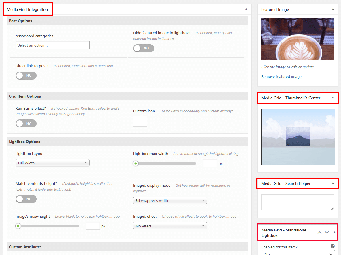
Content will be resized accordingly to the value you set. (minimum is 320px) - Set thumbnail's center
-
Clicking on wizard you can select with ease the center of the thumbnails that will be shown in the grid.
By default the center of the image will be used.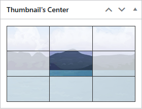
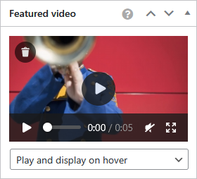
- The featured video
-
This system applies a looped and muted video on the item in the grid context. It's shown on hover or totally replaces the featured image depending on the chosen mode. To not affect grid's loading time, you should use a short video having a size coherent with the frontend grid item's one.
- Slider height
-
Slider's height in PERCENTAGE value is always referred to slider's width to always maintain the same aspect-ratio also on small screens.
For example if you set 50% height and slider is 1000px wide, the resulting height will be 500px - Add captions to slider images
-
Each image may have a caption: they are taken from the Description image's field.
You can reach that field from the media archive of your wordpress installation or from the "Manage Images" button of media-grid.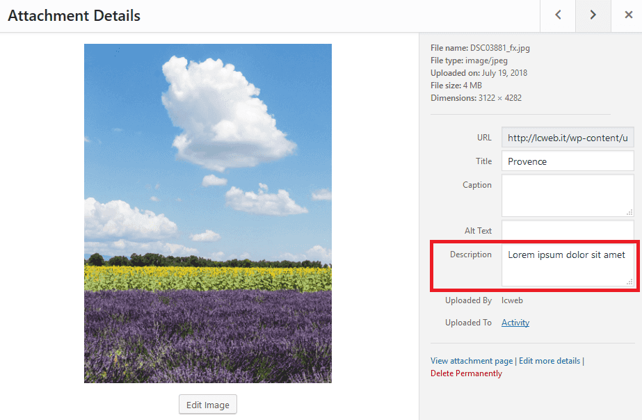
- Attach videos to slider images
-
You can attach Youtube and Vimeo videos to lightbox slider images.
Just copy the video URL into the wizard, clicking on the "play button" of selected images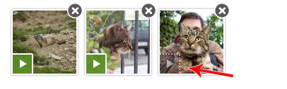
- Video - Self hosted videos
-
You can also display the videos uploaded on your website. Supported formats: mp4, m4v, webm, ogv, wmv
Player supports multiple formats at the same time to guarantee cross-browser compatibility.Use comma split video URLs.
- Audio/video types - players skin
- You can switch between light/dark and modern/classic skins in the plugin settings > colors > Audio & video players theme
- Audio type - Soundcloud, Mixcloud and Spotify
-
- SoundCloud - use the track URL
- Mixcloud - use the track URL
- Spotify - You can embed whatever Spotify element (track, playlist, artirt). Use the URL given by Spotify (how to do it?)
NB: filling this field, the selected self-hosted tracklist will be ignored
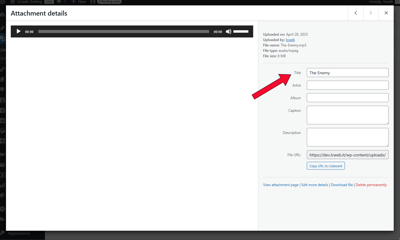
- Audio type - track title
-
The title shown in the grid item is the one specified in the WordPress Media Library's editor
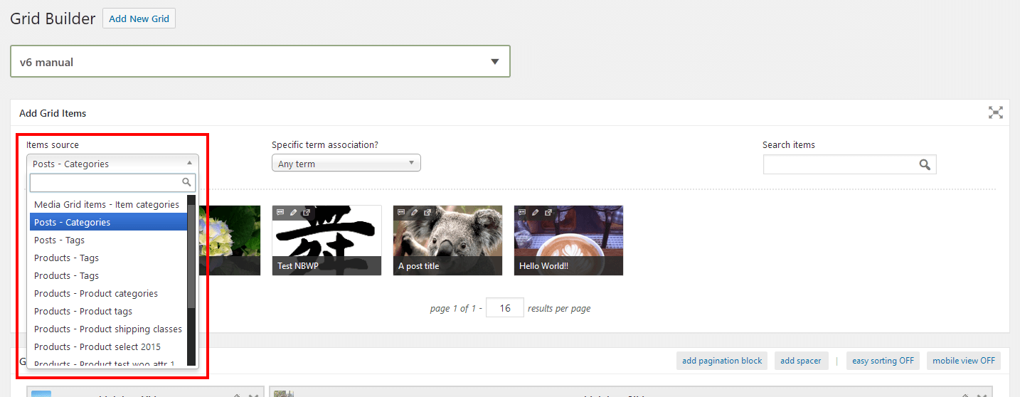
- Post type integrations
-
This item type can fetch contents from any post type having an editor in WordPress (e.g. posts but also woocommerce products). The essential requirement is to have at least a taxonomy associated to the post type.
- WooCommerce products
-
Using WooCommerce products as source, shown items will be directly referred to the Woo product.
This means that lightbox layout and attributes must be set in that product, through Media Grid options box.
Grids can be also filled with existing posts. Requirements are:
- being part of a public post type associated with a taxonomy (eg. WP posts are associated with categories)
- posts must have a featured image
Posts will be fetchable in grid builder selecting the related post type.
Posts will be managed as SINGLE IMAGE items, with attached lightbox.
However you can turn them into a direct link item through the related option, in "edit post" page.
In fact every post has got an own panel with specific options, similar to the one used in Media Grid items
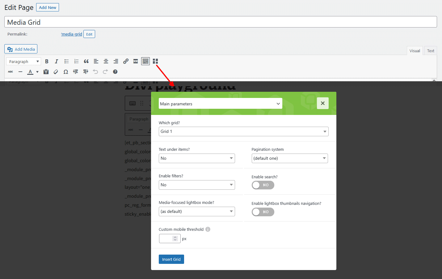
As first, click on "Add new grid" and create your first grid inserting its name.
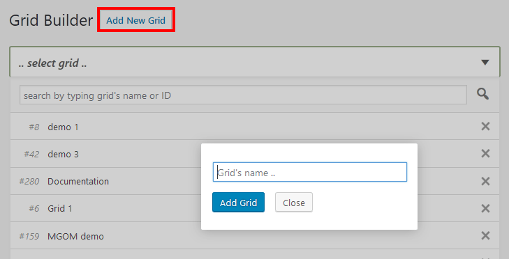
Once added, you'll be able to delete, clone and rename it directly in the grids dropdown.
Then, you have to choose whether to create a manual or dynamic grid. Here are few common notes:
- Layout mode
-
This option is available on both manual and dynamic grids, among sidebar options and controls the grid layout mode
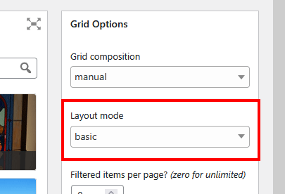
- masonry - the default Media Grid one. The engine will try filling every empty space
- basic - items will never change the order you added them in the grid
- "auto" height
-
Using this option, item's height will be calculated basing on its featured image. Use it to avoid image crops.
It is supported only by items showing a static image (eg. inline slider and video aren't included). In manual grids you won't be able to choose it, while in dynamic ones you'll have to setup a fallback for possible items not supporting "auto" height.
One for desktop and one for mobile modes.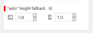
In the builder "auto" height items are rendered as a 1/4 for technical reasons - Spacer block
-
On top of "Grid Structure" section you find a button to insert spacers into the grid.

They are essentially empty spaces, used to add gaps between grid items. Once added, you can also choose to show them only in desktop or mobile mode: this option automatically reflects in the builder. To manage an hidden spacer, just switch grid's mode.
Finally, spacers can have "zero" height. This comes handy when you simply want to break the masonry layout and place next items underneath.
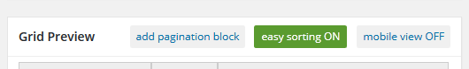
- Easy sorting mode
-
Mainly addressed to grids having many items of similar shapes, it allows fast sorting without masonry involvement
- 1-position move buttons
-
Sometimes things can become complex using drag&drop items positioning.
Using these buttons you'll move them one position backwards or forwards.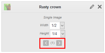
- Grid preview
-
You can preview the grid you are building without placing it on a page. Before you have to set preview container's page in plugin settings.
Remember to save the grid before previewing it.
- Pagination block
-
Adding this block, you enable the grid pagination. Basically is a 100% wide block you can freely move in the builder to split items as you prefer.

Media Grid is also natively integrated with WordPress Block Editor (Gutenberg), Elementor, Visual Composer and Divi Builder.
Using them you can skip the standard shortcode wizard and use the related Media Grid tool.
For any other builder or using the old WordPress editor:
Here's a demo shortcode with all possible parameters:
[mediagrid
    gid="5"
    title_under="1"
    pag_sys="standard"
    search="1"
    filter="1"
    filters_align="left"
    hide_all="1"
    def_filter="15"
    mf_lightbox="1"
    lb_thumbs_nav="1"
    mobile_tresh="800"

    cell_margin="10"
    border_w="6"
    border_col="#4dcf4a"
    border_rad="4"
    outline="1"
    outline_col="#c73730"
    shadow="1"
    txt_under_col="#ededed"
]
Specfic Notes:
- Filters alignment
- Enabling filters now you can choose where to place them. On top, by default, or on item sides.
- Enable search
- Using this option, you'll enable the search bar. Its position will change accordingly with filters.
Search bar is described in next documentation's chapter. - Media-focused lightbox
- Using this option, you'll enable the media-focused lightbox mode in the grid.
By default the parameter follows the global option, defined in settings. - Lightbox thumbnails navigation
- Using this option, an interactive row of grid item thumbnails will be placed below the lightbox body
- Custom Treshold
- Allows you to alterate the mobile treshold. Then you can use desktop layouts also on tiny grids.
- Customizations section
-
Gives you the ablility to set individual values for grid aspects (margins, borders, etc), overriding default ones.
Media Grid has got a search bar to easily find items in grids.
It is enabled in the shortode wizard and aligned accordingly with filters.
By default the search is performed against items title and contents.
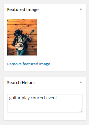
It's also possible to add some terms to be matched by the search engine through the Search helper, in "Edit Item" page.
Remember that minimum length for searchable words is 2 characters.
Media Grid borns as a portfolio plugin, however from v7 it got the ability to populate grids with WP Library images and the media-centric lightbox mode. Therefore it can operate as a sort of photogallery.
So, it worths explaining the main lightbox differences and how to manage them.
Content-focused lightbox mode
It's the default mode, the one always used from Media Grid since 2012.
Suggested if you have to show long and complex contents.
Lightbox sizes are defined in settings and do not change in relation to lightbox media contents.
No height limit, in case of tall medias or long texts, the user has to scroll down in the page.
Media-focused lightbox mode
Introduced in v7, emulates classic lightboxes behavior by changing its sizes depending on the media shown.
Text is placed on right/left side and lightbox height is limited to the screen's height.
On mobile, obviously, texts will be placed under the media and users will have to scroll down to see it.
This mode can be enabled globally through the related settings option or individually for each grid, through the sortcode wizard (or builders module)
Starting from Media Grid v9 is possible to show up your items, posts, WooCommerce products and Media Library images through the lightbox without using a grid.
The system works with precise HTML classes usage, tracking user clicks to throw the lightbox.
In any item/post/etc editor that would feature the lightbox in a normal grid, you will find a new sidebar box. Each of them must be enabled singularly in order to be used.
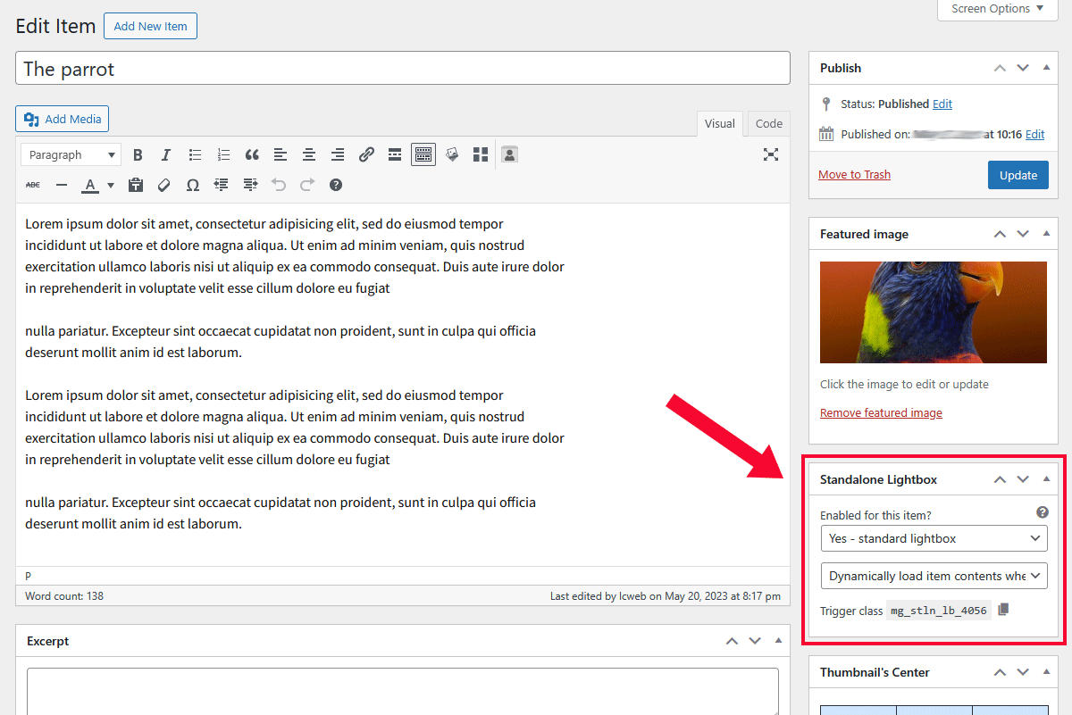
The second field defines how lightbox contents are loaded in the website: in most cases the "dynamically load" option is the best for you.
Switch to "always pre-load" only if you have a very slow server or need a clickable element to be ready few moments after the front pages are displayed.
The panel also shows the class to be used. For example: mg_stln_lb_4056
Any modern builder has got a dedicated "classes" field where you can paste it. Here's an example for Gutenberg:
Any website element can be attached to this system: in other words you can trigger the lightbox clicking on any website element.
They can be enabled in settings > Lightbox > Comments.
Is possible to use self-hosted comments, Disqus and Facebook Comments
Self-hosted comments
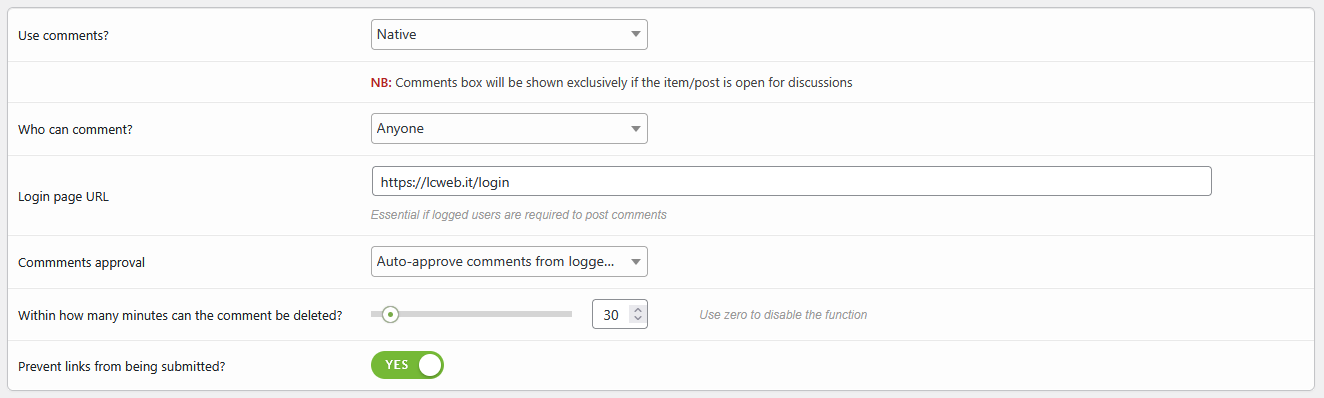
It uses the WordPress comments engine. You will be able to manage approvals, comments opening and users as you would do with any other website post.
Disqus
Its integration is really simple: just insert the shortname. Style, moderation and details are managed directly on Disqus
Facebook Comments
This requires multiple steps and more skills:
- create a new app and paste its ID into the related field
- Media Grid automatically inserts Facebook meta into the website to link comments to your app
- before launching comments, be sure to have set moderators here clicking on "settings"
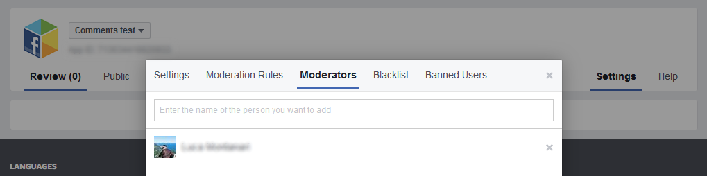
- If everything is ok, moderators will see the moderation label on top of comments form and you will receive notifications through the app
The plugin is 100% multilanguage for both front and back ends. If a translation of your language has been created, WordPress will automatically switch between languages.
Plus it is WPML certified and compatible with Polylang and qTranslate!
How to create a translation
If you have WPML + String Translation add-on or Polylang, you can simply scan the plugin and translate strings via its UI.
Otherwise: go in the plugin folder, then open the one named "languages".
Inside you'll find the default.pot file. It contains english strings to be translated.
If you want to create or customize one your language translation, follow these steps:
- Open the default.pot file with POedit
- Edit the catalog by inserting your data and setting translation's language
- Save the file with your language's i18n identifier and "mg_ml-" prefix (the italian example is mg_ml-it_IT)
- Go to plugin's folder ".. wp-content/plugins/media-grid/languages" and paste resulting .PO and .MO files
To translate item custom attributes you necessarily need to use the WPML string translation plugin or Polylang.
If you create new translations, please contact me at [email protected] sending your .PO and .MO files.
Otherwise they will be lost in next updates. Thanks!
WPML / Polylang guidelines
- Translate item categories
- Duplicate items
- Disable auto-sync with original language and translate items
qTranslate guidelines
- Translate item categories
- Translate items